Frightening Ways Your Website is Losing Leads

It’s Halloween, and in honor of the holiday, we’re going to take a look at some frightening ways your website could be losing you leads. If your website is not properly set up to get conversions and bring in leads, you’re losing out on potential business and bleeding money. The scariest part is, you’re probably not even aware of it!
There are many fundamental items your website must contain to have a high conversion rate – these include layout, design, and content. If your website is missing even just one of these important factors, your bottom line could be affected.
Above the Fold
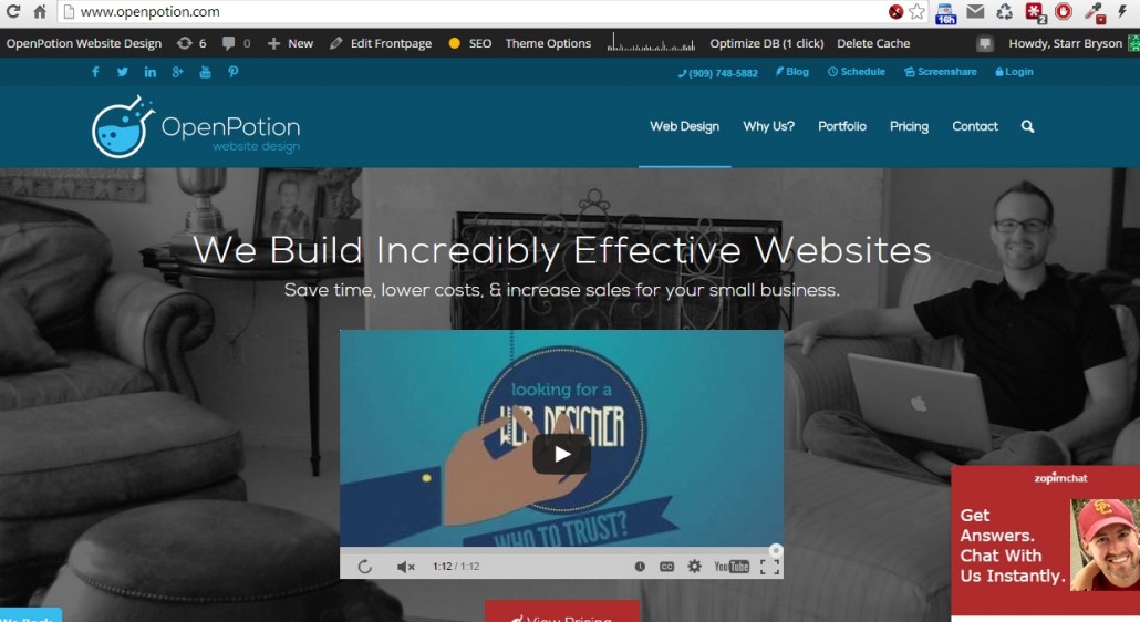
What is”above the fold” and why is it important? Above the fold is the area of your website a visitor will first lay eyes upon when coming to your site, the area that is visible without having to scroll down. Sometimes referred to as the hero or the showcase area, this is your first chance to catch people’s attention, tell them what you can do for them, and address their pain point.
You want to answer their question: What’s in it for me?

Does your showcase area effectively target your key audience? Does it contain the important elements that will turn visitors into customers?
If the answer is no to either of these questions, then you could be losing out on potential business.
Homepage Content
Of course, when we think about content, we think about the words on the page and crafting great copy to draw in our visitors and sell them on our products. What most people don’t know is that content isn’t just words.

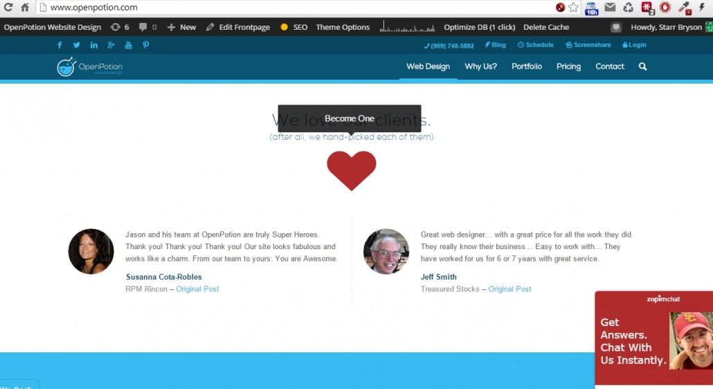
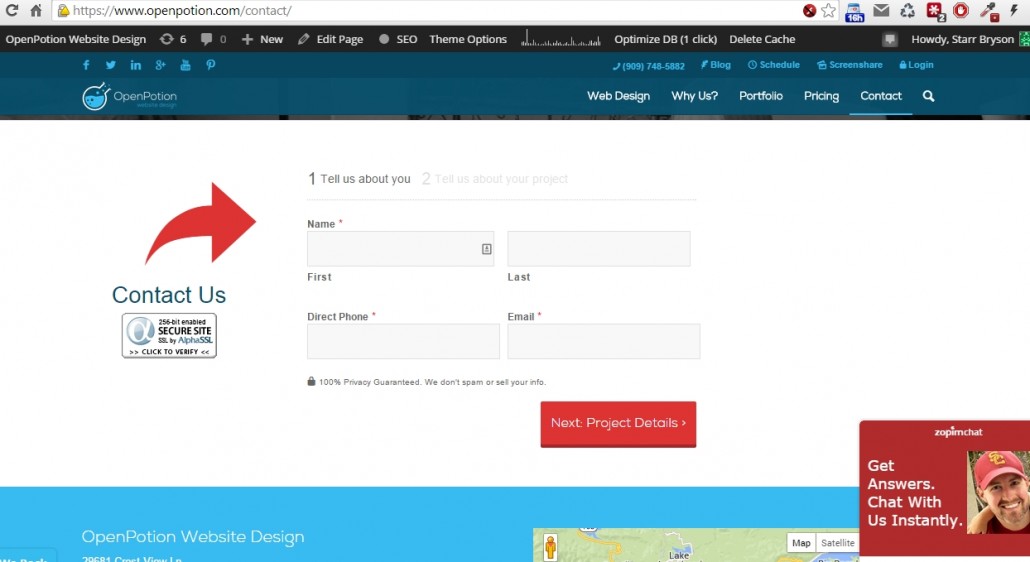
There are key elements every website needs to have to grab attention and convince your would-be customers that they need you. These include forms, social proof, and up-to-date contact information, just to name a few. Above and beyond that, there is a specific formula to these elements that, if followed, will greatly transform your business and increase your sales.
Other Features
Websites that are built for marketing will assuredly capture more leads and increase your sales. There are many features a website can include to capture these leads, and if your website doesn’t have these items, you’re bleeding money and missing out.

So, how do you know if your website is effective at capturing leads and turning over conversions? Which features should your website include, and what should your forms ask your visitors for? If only there were some type of test you could take to figure all of this out for you . . .
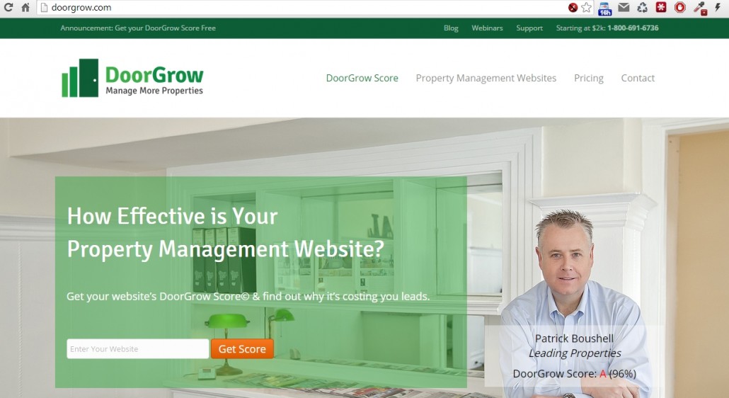
Introducing DoorGrow, a simple test you can take in just a few moments to evaluate how well your website is at getting you those leads. Geared towards property management websites (because that’s our specialty), this test will walk you through your website step-by-step and ask questions to determine if you’re losing out on leads or converting like a pro.

Editor’s Note: If you’re not a property manager or a property management website, don’t be afraid to take the test, too. It’s targeted towards getting more doors for property management companies, but it’s still a great test to evaluate key elements every website should have to increase conversions and sales.
Building incredibly effective websites is what we do at OpenPotion—after all, we’re marketers first and designers second. Take our free test today and discover for yourself if your website is costing you leads.
-Starr, Content Goddess


