The Call to Action: Why one little tweak might be all you need
A single change, 90% more clicks.
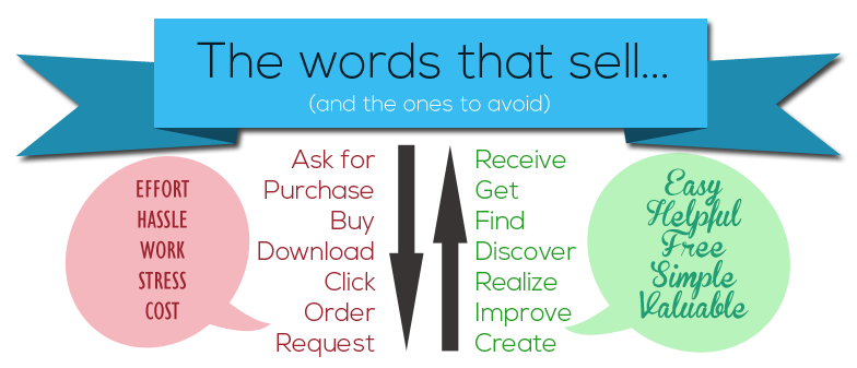
Getting the call-to-action right is a fine art. Unbounce.com recently ran a test on one of their landing pages that offered a free 30-day trial to new users. All they did was change “You” to “My”, making the new call-to-action read “Start my free 30 day trial”. Within three weeks, they had raised their click-through rate by 90%. In another example of excellent CTA optimization, MatchOffice.com reworded the text of one of their buttons from “Order Information” to “Get Information”, and saw nearly 15% more people click it.
Easily do it on your own website.
All it takes is one simple tweak to a button, and you have a recipe for success. People respond better when they a required to put in minimal effort. Single words carry many connotations, so you need to make sure you are picking the right ones that say the right things about you.

Get us to do it for you.
OpenPotion has been advising companies on conversion optimization techniques like this for years, and we can help you. Changes like this are quick and easy to do, and it will surprise you just how effective they are. Simply click the button below and we’ll be in contact shortly to get started.
Pssst, a little sneaky discount for our clients.
Cut some corners and get a pretty great deal. Should you subscribe to our Silver Plan, you will benefit from an included hour of website development every month (a value of $129!) to make tweaks and touches to your website. Amazing! Here’s just some of the things you could do with that time…


Leave a Reply
Want to join the discussion?Feel free to contribute!